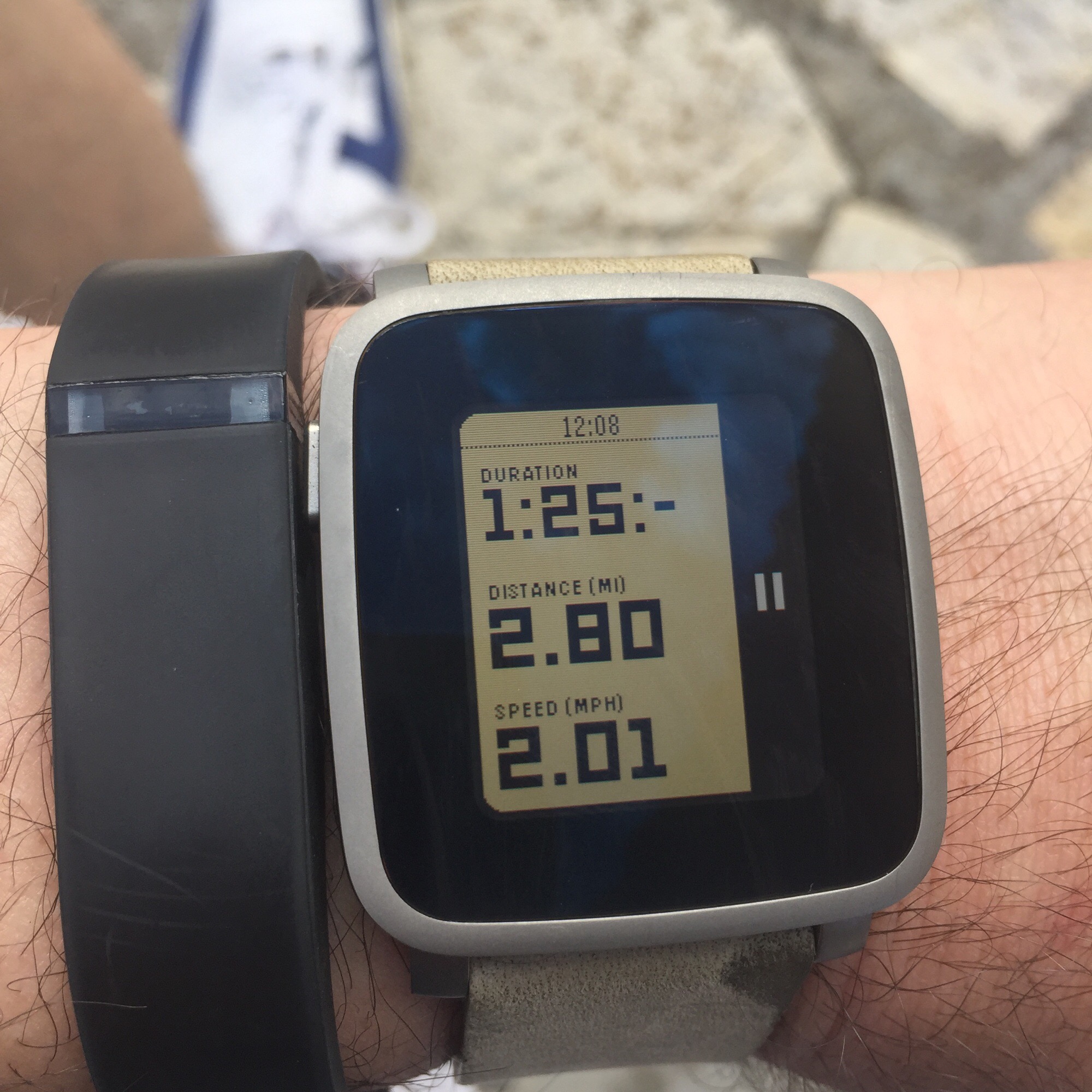
Just thought I would put down my initial thoughts on the new Pebble Time. I’ll do a fuller review, including the same tests that I ran with the old Pebble, in a few weeks when I have captured more data.
I’ve had my steel version a couple of weeks now and it really like both the look of the watch and the new interface itself. In fact Apple seemed to like the timeline too so they pinched the idea for their watch!
When you pledged via Kickstarter the Steel variant comes with both a leather and steel link straps. However, to date, only the leather strap has arrived and the other is due before the end of October we are told.
Let’s get this out of the way right now. I hate the leather strap. It neither looks nor feels like leather. It’s more like suede and has a couple of oily stains on it already. However, I never intended to use this strap so it is only a temporary measure I hope.
Seeing the pictures of the watch on Kickstarter one thing that concerned me was the massive black border around the watch face. This isn’t as distracting as I thought it was going to be although I do wish the watch face was a little bigger but it is fine. The build of the watch is superb with the knurling on the buttons really nice and tactile. All in all a very well made package.
Along with the new watch is a new interface. The big selling point was the timeline feature where you can scroll back and forward through time looking at entries such as from your calendar, the weather and travel. This works incredibly well and while useful isn’t something that I turn to everyday. However, the animations on receiving a notification I love. Whether it is the message in a bottle for an SMS or the Snapchat or Skype logos these are fun and really great to watch (every pun intended!).
While this isn’t a huge update over the original it is a good one and I’m glad that I upgraded.
Look out for the revised battery and steps update over the next few weeks.
